Leverage finance KPIs to build a cohesive, knowledgeable and forward-thinking organization.
- Gartner client? Log in for personalized search results.
Finance KPIs and Metrics to Measure Success

Make your finance KPIs easy to understand
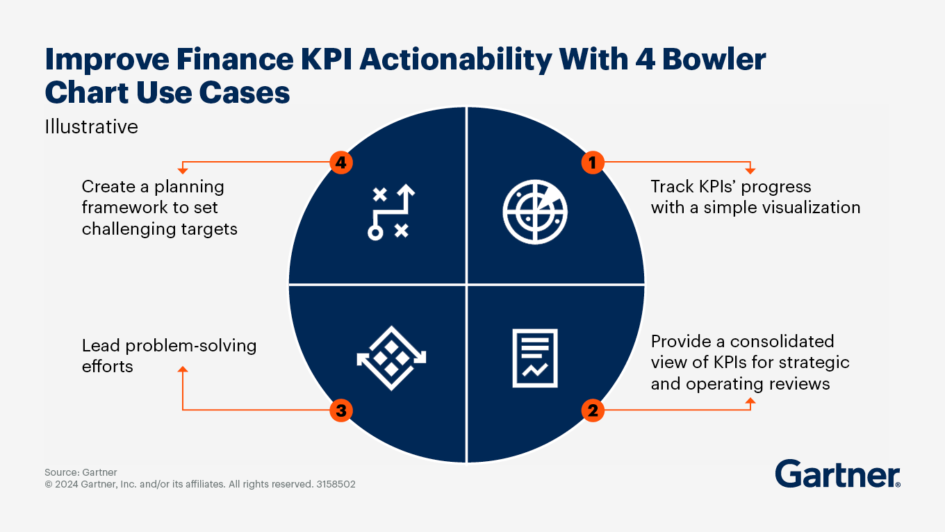
Reporting the right finance KPIs is the backbone of traditional performance management, but FP&A leaders often struggle to present critical KPIs. Use bowler charts to enhance your finance KPI reporting best practices.
Simplify KPI visualization: Clearly show if goals are met.
Lean transformation: Prioritize problems, investigate causes and create action plans.
Continuous improvement: Foster a mindset of improvement by setting and tracking challenging targets.
How to align finance KPIs to business goals
To maximize the impact of finance KPIs on business performance, present clear data stories around the most relevant finance KPIs. Start by focusing on three key areas.
Finance KPI Selection
Governance and Guardrails
Actionable Reporting
Define key outcomes, then map aligned enterprise goals and finance KPIs to them
Finance leaders must respond to stakeholder requests for information and support data-driven decisions. But without a framework to clarify stakeholder information needs, leaders risk delivering low-value, misaligned and ineffective insights.
Driver mapping solves the problem by aligning both enterprise and finance KPIs (and related data management, governance, reporting and analytics activities) to business outcomes. By mapping both enterprise and finance KPIs to drivers, you can determine the most relevant finance KPIs and metrics objectively and recommend them to decision makers based on factors such as data quality, latency, effort and timing.
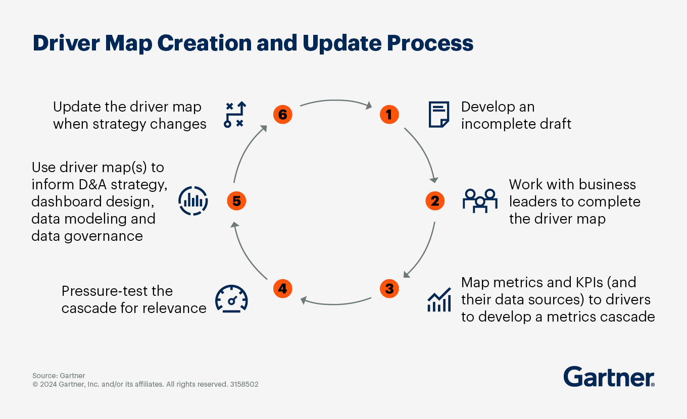
To create a driver map, follow these steps:
Step 1. Develop a draft
Spend 30 minutes or less drafting a visualization of a driver map, which can then be shared with business leaders for feedback. Begin by identifying the target altitude (e.g., an entire organization, business unit or project). Then follow these substeps:
Identify the primary, quantifiable North Star value outcome that the business, product or project you are mapping should deliver.
Note the primary strategic drivers that will determine performance against the value outcome.
For each strategic driver, identify tactical drivers related to core processes or new initiatives that will drive performance.
Note any tactical, day-to-day activities that will impact each operational driver.
Important: The map should represent the primary drivers business leaders manage; it doesn’t need to be a complete scientific mapping of the organization.
Step 2. Work with business leaders to edit the draft
A driver map should reflect how business leaders view operations delivering financial or other strategic outcomes. Use an incomplete or generic driver map as the basis for discussion and let business leaders add new drivers, redefine relationships and otherwise co-edit the initial draft.
Step 3. Develop a metrics cascade
Map any finance KPIs or metrics that the organization currently reports to each driver those metrics describe. This will create a metrics cascade and allow you to further rationalize the finance KPIs and metrics that are reported. Drivers with too many finance KPIs and metrics (or too few) are easily identifiable: At most, there should be no more than five KPIs per driver.

Step 4. Pressure-test the cascade for relevance
Using regression or lagged regression analyses, test the relevance of finance KPIs and metrics for each driver. This quantitative approach is also useful to cull the list of potential metrics and KPIs to a more reasonable number. For example, if your commercial leader believes new business is driven in part by territory size for sales reps, analyze the relationship between territory size and new business revenue.
Step 5. Use driver map(s) to inform D&A strategy
Your driver maps should be a reflection or an abstraction of your enterprise’s D&A strategy. They may not only be used to inform decision makers with actionable and relevant information, but also to develop more intuitive dashboards, improve relational data models (such as data marts) and prioritize the work of data governance.
Step 6. Use a hybrid approach to curate the driver map
Revisit the driver map during the annual strategy process to determine whether finance KPIs are still relevant or an update is needed. Also consider hosting select maps on your organization’s intranet site or in business intelligence tools for further transparency and decision alignment.
Create guardrails around finance KPIs to improve the quality of business decisions
Most business decision makers consider less than half of the broader financial implications of their operational decisions — and over 20% of business decision makers don’t consider any. The resulting low-quality decisions can cost as much as 3% of an organization’s earnings.
Placing “guardrails” into decision-support tools brings needed balance between decision-maker autonomy and decision governance. A guardrail defines a range of acceptable choices, allowing decision makers to act independently while preventing them from compromising finance KPIs.
Consider this example:
A company’s FP&A team uses established finance KPIs to embed a predetermined inventory-to-sales ratio, i.e., a guardrail, in the company’s inventory purchasing tool.
When a decision maker inputs a purchase amount, the tool calculates a resulting inventory-to-sales ratio based on the established finance KPIs.
That ratio is automatically highlighted in the tool and shared with FP&A if it falls outside the acceptable ratio. FP&A then discusses the decision with the relevant decision maker to determine how to proceed.
When decisions are flagged for falling outside the finance KPI guardrail, preprogrammed recommendations provide the decision maker with guidance while promoting the flag as an opportunity to:
Encourage conversation. Follow up with decision makers to discuss the rationale behind their decision and your preprogrammed suggestion.
Place the flagged decision in context. A decision outside the finance KPI guardrail may be acceptable for certain conditions. In the inventory example, exceptions might be product seasonality or abnormal sales months. However, future months are also adjusted to ensure the ratio eventually falls back within the guardrail’s limits.
A decision maker does not need FP&A approval for a decision that falls within a guardrail or if they can find a way to independently course-correct.
The benefits of guardrails are twofold:
The guardrail catches decisions that could compromise finance KPIs and helps course-correct.
The business can make financially sound decisions independently because the guardrail removes unnecessary interventions or governance.
To determine which decisions need guardrails, start with the ones that have the most impact on other decisions.
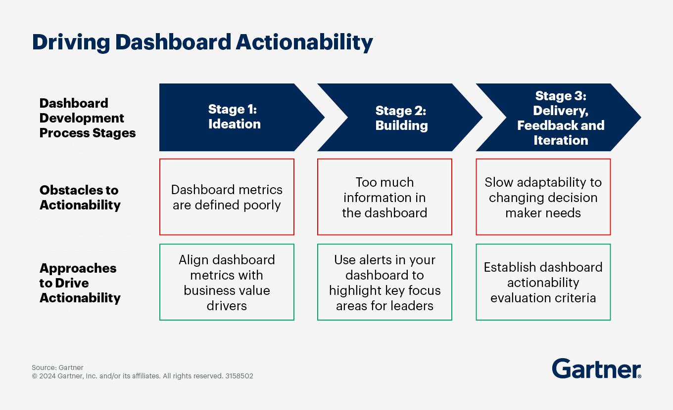
Improve finance KPI dashboard viability by aligning metrics to value drivers
Most finance dashboards provide information on performance trends, but fail to help decision makers act on that information. Accelerate better-quality decisions by addressing the three most common obstacles to dashboard actionability:
Poorly defined finance KPIs and metrics — Metrics in the dashboard are not defined clearly, resulting in differing and conflicting interpretations on how to react to changes.
Information overload — Dashboards include an overwhelming amount of information, making it hard to pinpoint the information that should prompt action.
Slow adaptability — Decision maker and business needs change quickly, causing dashboards to lose relevance.
To overcome these challenges, follow these steps:
Align finance KPIs and metrics with business value. FP&A leaders often report that the decision makers in their organization misunderstand key finance KPIs and metrics. This is because the metrics are not clearly defined. To solve this challenge, develop a map to help decision makers visualize how finance KPIs and metrics support key business decisions.
To map metrics to the business model, leverage your understanding of your organization’s value drivers. Begin by initiating a screening workshop with data owners in finance and the business to establish links between new financial and nonfinancial performance data:
Build an inventory of current and potential finance KPIs and metrics to incorporate into standard performance reports.
Map the finance KPIs and metrics to the business model through a metrics cascade.
Define the value-mapped metrics to provide relevant context in the dashboard.
Use alerts to highlight key focus areas. Highly actionable dashboards highlight critical variances and trends. When fine-tuning your dashboards, develop a mechanism to immediately alert decision makers of areas that require their attention. Use color coding and other signals strategically to grab decision makers’ attention on priority data without distracting or overwhelming.

Establish evaluation criteria to maximize actionability. The most actionable dashboards allow for frequent updates as key finance KPIs and metrics evolve with business goals. To ensure your dashboard is “actionable” and not just “functional,” focus on elements of the dashboard that help users determine if the information is accurate, where it comes from and how to consume it.
Test your dashboard’s actionability at the user level by answering these questions:
Are the permissions configured appropriately so the intended audience can see all parts of the dashboard?
Is this dashboard designed for the right audience?
Will the audience understand the dashboard?
Will the dashboard be seen by internal stakeholders or by customers and external partners/suppliers?
Has the audience for this dashboard changed?
Is the information in the dashboard up to date with current user needs?
Test actionability at the business level by answering these questions:
Does the dashboard answer relevant business questions around appropriate finance KPIs and metrics?
Does the dashboard tell a coherent data story (either on its own or in the context of other existing reports)?
Is the dashboard relevant for a specific line of business only, or is it more for a general audience?
Does the dashboard include finance KPIs and metrics on the most pressing, recent business issues?
Attend a Conference
Join Gartner experts and your peers to accelerate growth
Gather alongside your peers in National Harbor to gain insight on emerging trends, receive one-on-one guidance from a Gartner analyst and create a strategy to tackle your priorities head-on.
2 – 4 Jun 2027
Gartner Finance Symposium/Xpo™
National Harbor, MD

Related content
Gartner clients: Log in for a complete suite of actionable insights and tools on finance KPIs.
FAQ on finance KPIs
What are finance KPIs?
Finance KPIs (key performance indicators) are metrics used to evaluate the financial health and performance of an organization. They help track and measure critical aspects like revenue, expenses, profit margins, cash flow and return on investment. By monitoring these indicators, businesses can make informed decisions, identify trends and set strategic goals. Common finance KPIs include net profit, gross margin, operating cash flow and debt-to-equity ratio.
Why are finance KPIs important?
Finance KPIs are crucial because they provide measurable insights into an organization’s financial health, performance and efficiency. They help track progress toward financial goals, identifying trends and making informed decisions. By monitoring key metrics like revenue, profit margins and cash flow, businesses can optimize resource allocation, manage risks and ensure long-term sustainability. Effective KPIs also facilitate communication with stakeholders and support strategic planning.
What are the most important Finance KPIs?
Finance KPIs include revenue, net profit margin, gross profit margin, operating cash flow, current ratio, quick ratio, debt-to-equity ratio, return on assets (ROA), return on equity (ROE), earnings before interest and taxes (EBIT) and accounts receivable turnover. These metrics help assess profitability, liquidity, efficiency and financial stability, providing a comprehensive view of an organization’s financial performance and guiding strategic decision making.
What is a finance KPI bowler chart?
A finance KPI bowler chart is a visual tool used to track and display key financial performance indicators (KPIs) against set targets over time. It resembles a bowling scorecard, with columns representing time periods (e.g., months) and rows for different KPIs. Each cell shows actual performance versus targets, often color-coded for easy interpretation (e.g., green for on-target, red for off-target). This chart aids in monitoring progress, identifying trends and making data-driven decisions.
Drive stronger performance on your mission-critical priorities.